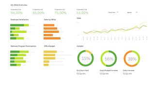
Qlik Sense recreated in Tableau is kind of visualization built totally for fun 🙂 If you are familiar with Qlik Sense and follow QS YT channel, then you probably have already seen this dashboard: (Qlik’s property) Link to full movie is available here. In my opinion dashboard here looks very nice. It is clean, consistent and encouraging to work with. Everything looks good but the problem is, that not all
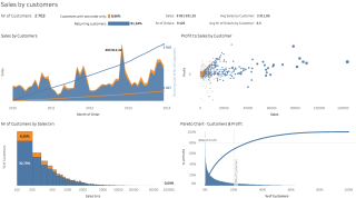
Data visualization is all about answering questions. Business grows and you already know how your sales by products go. Better understanding of who and how actually buys your products can help with creating customer profile, recognizing customer’s needs and with preparing marketing operations. What the average order of our customer looks like? According to data from last few years, our average customer makes orders 3-4 times a year, everytime ordering
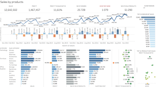
Data visualization is all about answering questions. Starting from basics, let us analyse sales by products dashboard. Sales departments usually want to know what, when and how many iteams were sold, so let’s try to answer these most frequently asked questions to better understand business we run. What is my income? The first metric shows total income as sales amount. This one is set to calculate the entire loaded orders