Qlik Sense Recreated In Tableau
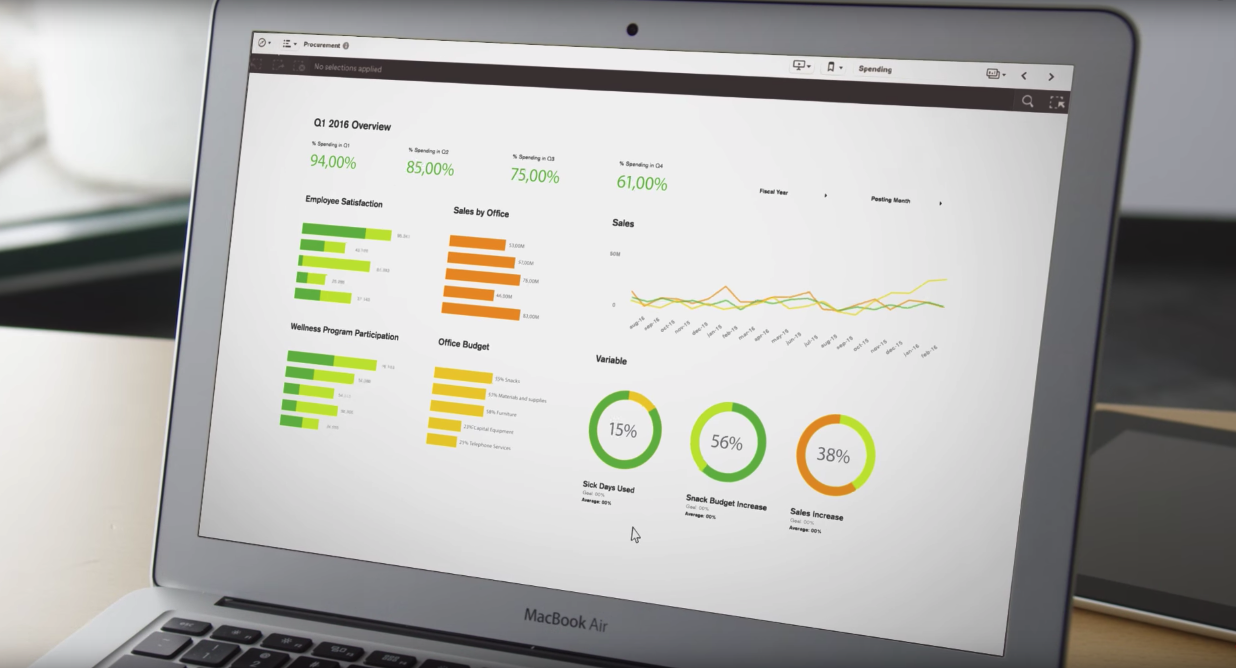
Qlik Sense recreated in Tableau is kind of visualization built totally for fun 🙂 If you are familiar with Qlik Sense and follow QS YT channel, then you probably have already seen this dashboard:
Link to full movie is available here.
In my opinion dashboard here looks very nice. It is clean, consistent and encouraging to work with. Everything looks good but the problem is, that not all visualizations from the movie are possible to recreate in Qlik Sense without any extentions. For example: values of the measures inside dognut (version of pie) chart is not allowed in QS so far.
But not everything is lost, because with help comes….. Tableau! 🙂 Having the possibility to create pixel perfect dashboard I decided to reproduce similar visualization and here you can see the final version:
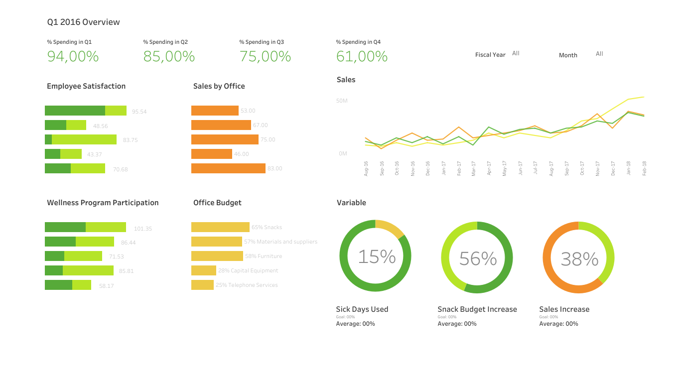
The dynamic version of Qlik Sense dashboard recreated in Tableau is here.
Is it at least similar? I think it is very like Qlik Sense. Probably it could be even better, but let me stop this mad project and finish up with my thoughts:
- I am not showing which BI tool is better. As I work with many BI tools I see that each of them are better for particular clients, environments and their needs. That always depends.
- From the data viz designer perspective, I’ll always prefer those tools in which I have influence on my data visualization design and style.
- In my opinion there’s nothing wrong with inspiring yourself from others work.
- Creating data viz is always fun 🙂
Leave your thoughts in comments. Thanks!